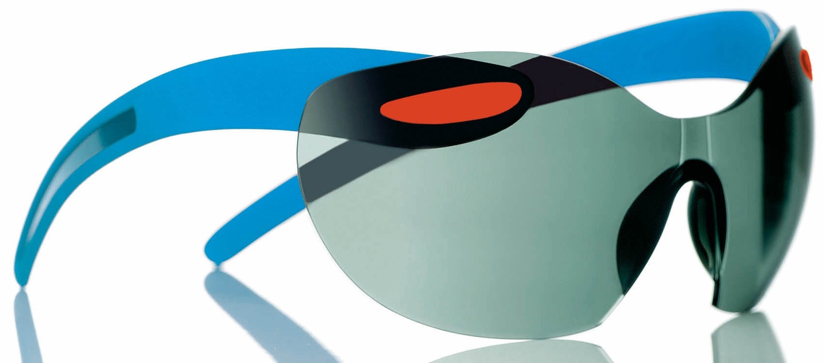
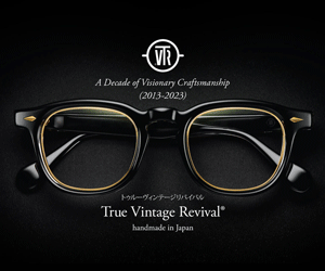
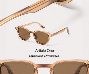
Vidal Erkohen, RVS by V. on colour
13th August 2012 Glistening gold, shocking pink, or delicate pattern inspired by Turkish tiles? RVS by V. from Turkey works with punchy colours and trendsetting tonal combinations as well as introducing innovative concepts for patterned frames. As part of our celebration on colour this month, Eyestylist.com asked RVS by V.’s Vidal Erkohen to explain his love of colour in eyewear. (Above: Custom gold and blue mirroring with @muratoptik for RVS Eyewear models “Morro” and “Naomi”).
Take me back to when you first started producing your own RVS by V. designs….what were your groundbreaking colours and colour combos then? At first my goal was to combine and use colours that were not being used at the time especially since bright colours were not yet back in fashion as they are today. Two of the most unusual colours I used and combined at the time were bright orange and silver which was very successful among our followers.

How has your work in colour developed and what do you feel is your signature style today? I think the fact we are able to combine any colours that our clients request is a big difference compared to other eyewear brands out there. I love how colours work together and even though most people shy away from wearing bright ones, let alone combining them with each other, we love to present something unusual with each model we release. We have now started to use patterned acetates and are combining them with plain colours as well as prints like those used for our “Iznik” collaboration. I am especially fond of our combination of pale pink and sky blue acetate which was named by one of our good clients (Coyote Degroot of Labrabbit Optics) as the “Miami Vice” combination. It’s one of my favorites; even though the colour combo may sound feminine, it balances well and looks as good on a man is it does on a woman.


Comment on your use of opaque and how that effects the colours you use? Ever since we released our brand, our motto has been to make the eyewear with the best matt finish out there and although many have persuaded us to release a shiny collection I am strongly against it. Our brand is, and always will be made with a matt finish. I believe it is our Matt finish that balances out our vibrant colours and represents the look of a pair of RVS frames. Also, the feel of our frames when worn is another aspect that is very important for me and I believe the matt finish we use makes wearing and touching our frames all the more enjoyable.

You have just started to use more patterned colour – the new model Celine above is a good example – please comment; it is quite a different look to your use of colour blocking? Yes, the patterned acetate is a first for us and a sign of what is to come in the future. The colours such as Camoflauge and Deep Purple we have used are colours that I believe women may not be used to at first but will open a new perspective on the classic larger sized ladies’ glasses out there. The use of colour and all their combinations offers even the most classic design dozens of different faces. This is one of our main goals, keeping things classic without repeating what has been done in the past. (more…)