
Sahra Lysell is the Senior Colour Designer at Ørgreen Optics in Copenhagen. She has been with the company for over 20 years.
How did you become a colour specialist – has colour always been a part of you and your personality? I have a degree in fashion design, but I have always had a very strong intuition regarding colour and had an interest in how different tones work as an expression for emotions, our state of mind, and culture in society. I feel fortunate to have been able to make a career out of working with colour and to be part of a company that understands it is a very powerful communication tool.
Does colour affect you in your daily life? I believe so – it is a big part of my decision-making in all parts of my life. For example, most of the art in our apartment was chosen for the colours and combinations of colour. I am drawn more by that than by the theme or the artist. My favourite painting is by the Danish artist, Michael Kvium. Called Pale Eyed View, it is a picture of a man standing in a red sea. The red is a mix of red, orange and purple. This painting taught me to use hues that are difficult to define. The colours are interesting, and often flattering on the face.

On a daily basis, I find colour plays a role in what I do. I love to cook, and I love to play with colours when making food. It is very rare that I serve a dish where the special hues of Mother Nature don’t emphasize the experience. Purple for beetroot, orange for carrots, red for tomatoes, and the colour of a perfectly grilled steak, red in the middle, then rose and at last crispy brown on the edge. I can also see my 3 year old daughter is inspired to eat certain things due to the colour itself. She loves red ice cream! I could serve her beetroot ice cream and she would go for it just because it would be an amazing red!
“I have always seen things in colour, my brain works in a very visual way. If we are working on a new collection at Ørgreen, people always wants key words to work from, but I need to start with three colours! For me, this sets a mood, starts an emotion, and then I can get to work….”


In my office, I have three pictures of Mexican cemeteries; it may sound morbid, but the pictures are amazing and show bright, colorful graves and cathedrals that celebrate the story of a life. I have always had these pictures to remind me about differences in cultures and how there are so many colour stories to be told!

As a person, are you more about bright statement colours or quieter softer tones? Or do you wear colour according to your mood? I use colour according to my mood, and I love combinations of soft tones with a touch of something bright. For me, it is always about balance. When I choose colours or clothing, I like to mix the extravagant with the down-to-earth, masculine with feminine, or past with present. As I mentioned earlier I love big colorful paintings, but also black and white photos. My favorite tones change depending on the subject..whether I am considering fashion, art, furniture or nature.
What is the key to colour in fashion? I guess that every one of us owns a personal approach to colour; this comes from how you understand society and what people are craving for – positivity, seriousness, provocation, purity, innocence… all of these things are influential. A strong intuition is essential.
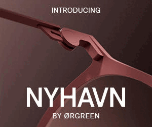
Find out more about about Ørgreen Optics and their new collections at www.orgreenoptics.com CN