Design + Inspiration

Eyestylist in Milan

Trend alert at Eyestylist: a neon flash

In the fashion world, everyone is talking about neon and flashes of colour combined with other tones and there are many accessories on this theme, as well as interpretations in the fashion collections. In Italy, at the recent eyewear fair there, Eyestylist saw many examples of neon detail and new ways of colour-blocking with bright tones in frames. For those who like these fresh flashes of colour, I’ve picked out two examples on black, but I’ve also seen some excellent shapes using classic tortoise with neon tones on the temple, end tip or as a lining, which are very chic also.

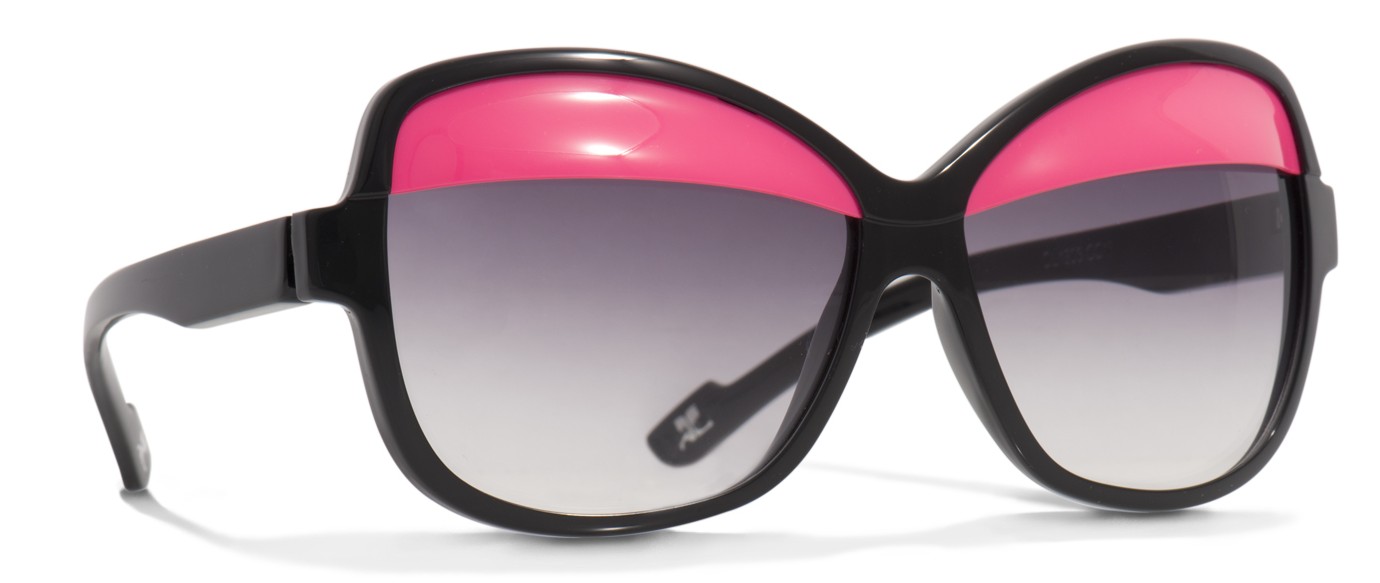
The newly launched Courrèges eye shades collection experiments with single tones – sherbets and fruit colours such as canary yellow and fresh orange – as well as two-tone contrasts, including the bright pink on black pictured. It’s an upbeat fashion collection that has instantly been noticed by the fashion boutiques – it’s available at Colette in Paris – and the playful interpretation of vintage Courrèges has been carefully re-worked through collaboration with French eyewear designer, Alain Mikli. The model pictured above is called ‘Eyelids’ and the eyelids themselves are removable. www.courreges.com/lunettes-paupieres.html
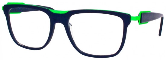
NEON 6600 c5 from Blue Magic Eye
Neon 6600 c5 from Blue Magic Eye

The Italian label Blue Magic Eye has adopted the neon theme in its latest collection, including this fresh acid green contrast on model 6600. The Bologna-based brand also produces frames in its 2013 collection with shocking pink and trendy turquoise flashes. This is a super way to wear colour on the face and adds edge to an everyday look. www.bluemagiceye.com CN
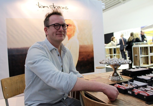
Men’s Eyewear – The Designer Approach

Tom Stevens Eyewear The Netherlands

26th February 2013 Tom Stevens reflects on “Men’s Eyewear – The Designer Approach”

Do you have a ‘role model’ when you design?  “Sometimes I use my dad’s face to work on a design. Of course, you always think about measurements, and fitting that is typical for male faces. I usually start drawing from an image/shape in my mind. Sometimes I fine tune a design on my father’s face.”

What is your perspective on colour, shape and material? “Taste is something different for everybody. I think a frame should complement/complete the face. I do prefer somewhat rounder shapes for men, instead of the very sharp-edged, angular frames. Regarding colours, I think a male frame should make a statement. If the design is good, many colours could fit. i prefer using only one colour on a design. If you use more, for example, two-tone, it is very important that the colours complement each other very well, otherwise it could totally destroy a good design. I love titanium designs for men in basic colours, but also fashion colours, like our neon orange model Lee.” (Below – inspired by Dutch singer  Lee Towers, from the 1980’s, who is also well known for his frames).


Lee in vivid orange by Tom Stevens

Nowadays, are men more experimental with eyewear? “Yes, I can see that more and more men like to wear a statement frame. Now it is more common to wear fashionable designs instead of very basic frames. Men are not afraid to wear a frame that stands out somewhat, and men like to distinguish themselves. I like this tendency – it’s fun!” www.stevenseyewear.com JG


Eyewear re-imagined

30th January 2013 ‘opti’ – the German trade show, where I have been this weekend, searching out new trends  – has highlighted again that the independent eyewear designers are setting the bar very high when it comes to quality, comfort and achievements in design and fashion styling. There is an extraordinary attention to minutiae – for comfort and aesthetics – and respect for time-honoured techniques in many of the leading creative collections. Here is a first taste of what is coming…our observations on the individual trends and directions will follow in the weeks ahead.

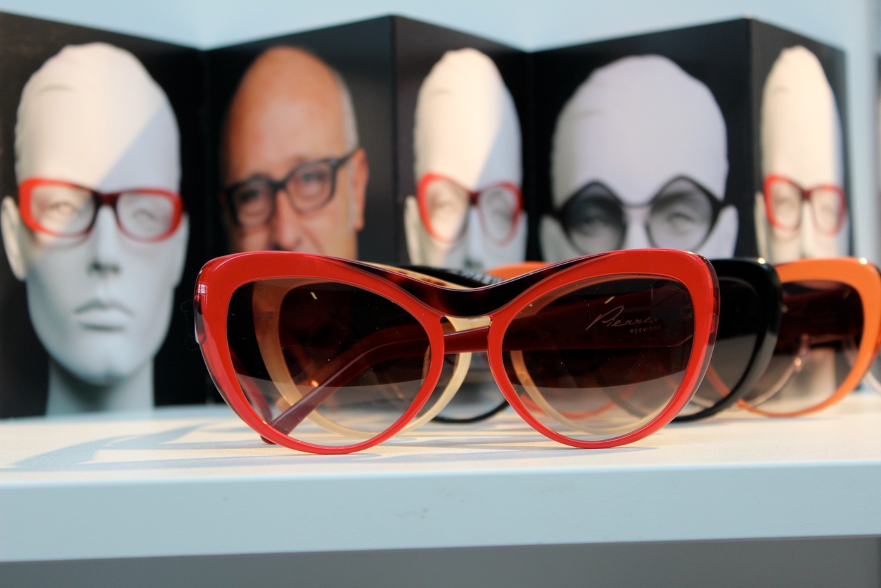
Above, Pierre Eyewear’s collection for 2013 combines French old-school glamour re-imagined in exciting colours and inventive shapes. Catch a glimpse, if you can, of Pierre’s new campaign images which are a discovery in themselves.  www.pierre-eyewear.com

Feb 31st
FEB31st with RIVA1920

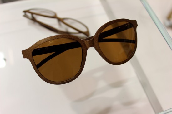
Italian wood label FEB31st launched a collaborative project with Riva 1920 this weekend in Munich. The frames in the edition are made from ancient kauri wood from New Zealand which has been preserved underground for 48000 years. Stefano Cipriani explained to me that the company has developed their own techniques to be able to create the frames in this exceptional natural material which has a unique texture, colour and smell. www.feb31st.it

L.G.R. Sunglasses
L.G.R. Sunglasses

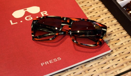
Luca Gnecci Ruscone, Founder of L.G.R. showed us their elegant optical collection at the Munich show, and their growing sunglasses collection which featured this handsome patterned piece. He also gave me a sneak peak of a wonderful new L.G.R. Limited Edition – more on that coming up.  www.lgr-sunglasses.com 

Photography above by Eyestylist.com.

For details on opti, the Munich trade show, visit www.opti-munich.com  CN


Ready for Resort!

Colourful Frames for Sunny Climes

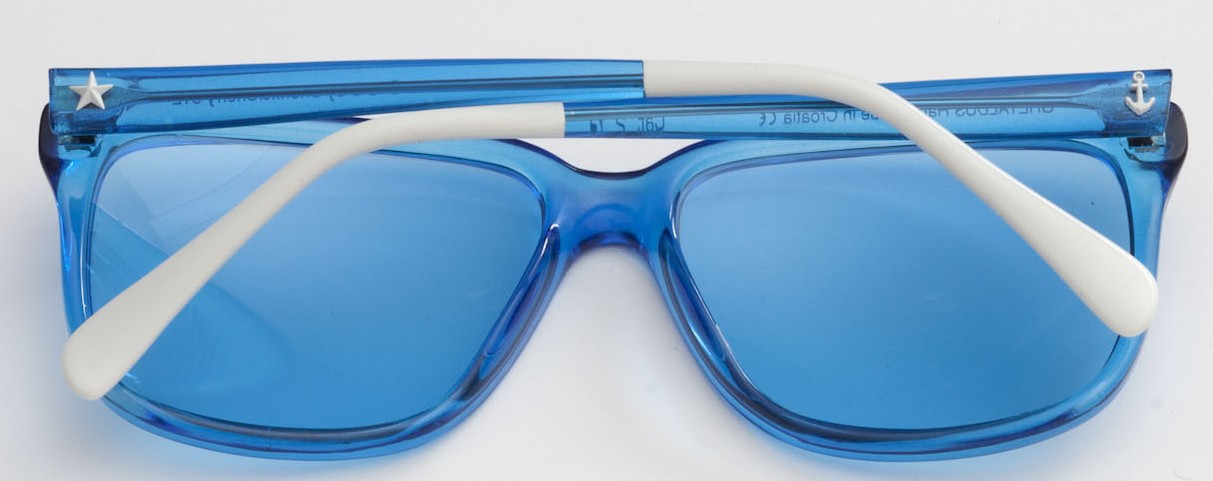
29th December 2012 When the temperatures dip to zero, resort fashions look so tempting…..so do sunglasses that look as if they were especially created for the beach and poolside. I’ve come across two lovely styles that are fun, colourful, and perfect for warmer climes and sunny days. Sheriff and Cherry’s nautically inspired Mediterranean blue acetate frames (above style 8766) with blue lenses are spiked with white trim on the temple ends, and an anchor and star motif, handmade in their Croatian workshop. www.sheriffandcherry.com

Beautiful colourations by Andy Wolf


Both sea and sky tones are featured in Summazeit (above) by Andy Wolf. Luminous acetate in tones of turquoise, violet, yellow and soft pink highlight the round shape. Handcrafted in Austria, the turquoise lenses are stunning! www.andy-wolf.com JG

Trend watch: grainy effects, textures, wood-look

I have been looking at the beautiful grainy effects and natural finishes and textures in eyewear. Not only are we seeing more and more frames made from horn and wood where the natural colouring, texture and natural grains in the material are clearly visible, but there are also more and more wood-look and marbled acetate styles on offer, that have grainy surfaces or striated colouring….all of which are very elegant and show remarkable attention to the end result.

Examples pictured here include the natural horn frame (below) by the Hong Kong based label Rigards – the textured surface is very beautiful, and reminds me of early 15th or 16th handmade spectacles but the Rigard shapes are interesting and often wacky for a 21st century interpretation. www.rigards.com

Horn spectacles by Rigards

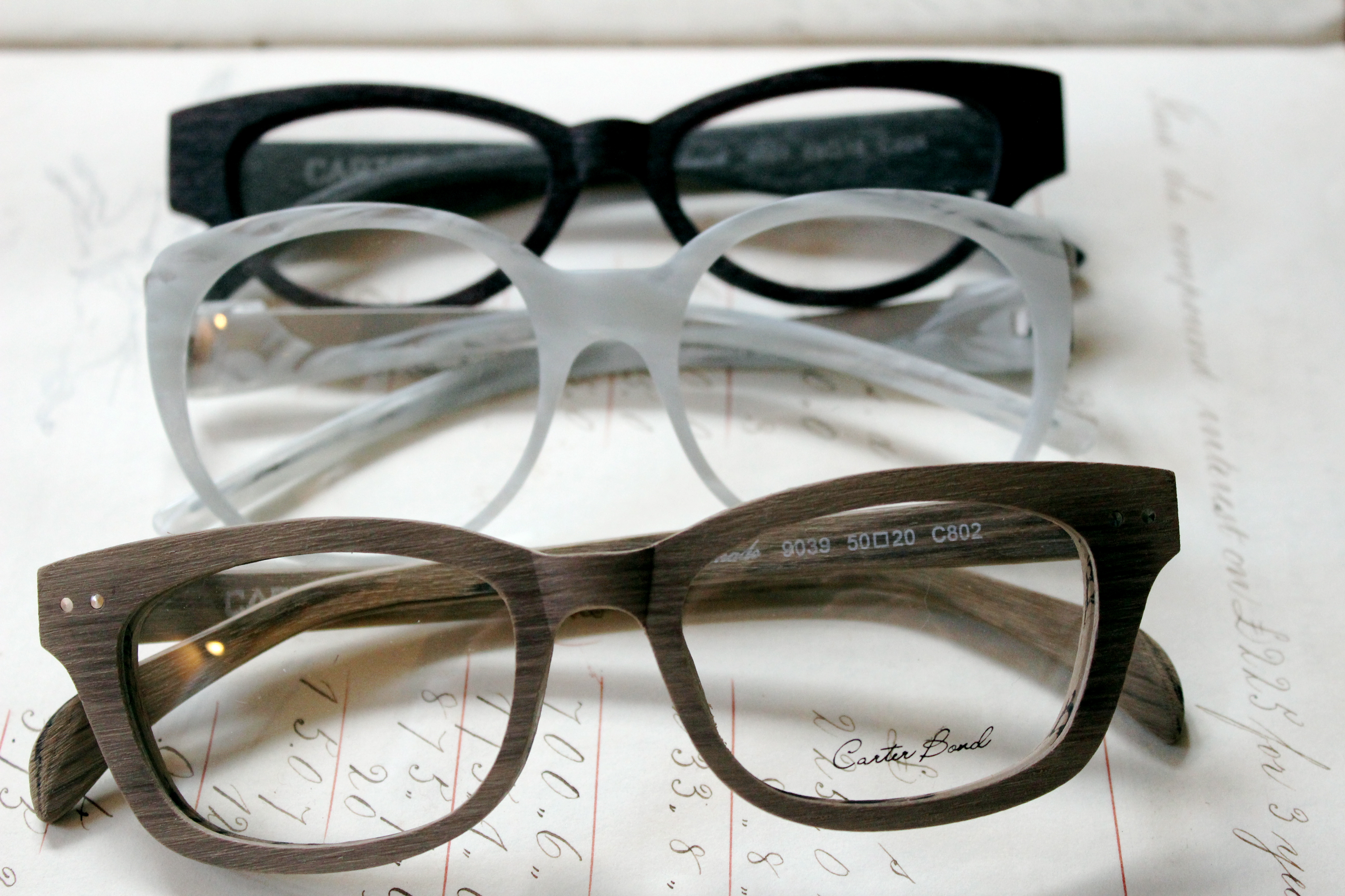
The Carter Bond frames (examples top and below), designed by Jono Hennessy, have the warmth and feel of wood to the point where I was sure it was wood; I have a selection of these sitting on my desk and everyone keeps commenting on how cool the matt wood frames are. But I have been put right: “These frames are acetate. It is a technique Jono has developed to give that natural wood look; the frames are fully adjustable, so they adjust and glaze exactly the same as another acetate frame.” Impressive! Designed by Jono Hennessy in Australia. www.carterbond.com

Carter Bond 9039

I am also very taken with the subtle textures inside smooth acetate. The white example from Bologna’s Blue Magic Eye (top image, centre frame, model BME V3107) shows a gentle pattern that is similar to that of the smooth inside of an oyster shell, coloured in a pure striated snow white and combined with a silver metal detail on the arms. It is a very chic design, robust, with a clever pairing of the materials. www.bluemagiceye.com CN