Eyestylist Exclusive by Clodagh Norton: The subtle effects of gradient colour in eyewear are beautifully explored in the latest frames.
Gradient, graduated or ombré colour has long had a place in the eyewear collections, with the effect dating back to favourite decades (1960s and 70s) in the past. The dark to translucent or bright to pastel tonal transitions can offer a striking alternative to classical eyewear colours, and with modern techniques to create variations in intensities and saturation levels, this harmonious expression of colour delivers fresh and flattering contemporary appeal.
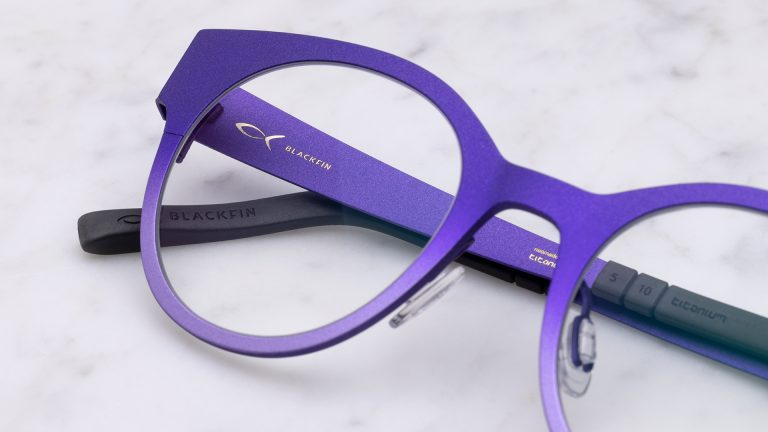
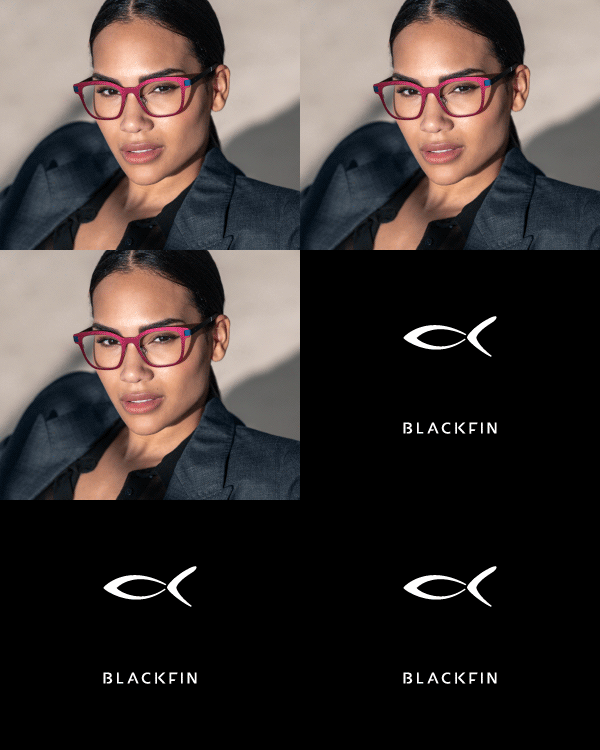
Some of the most wearable gradient frame tones on offer play with colourful complementary combinations of hues, informed by current colour directions in all areas of fashion and design. Italian company Blackfin, specialists in high-grade titanium eyewear, who have an established selection of frames in graduated colours to suit men and women, explores lots of variety in the matching of these types of gradient tones. “At Blackfin, we don’t see this as an exclusively seasonal look. We launched the gradient colour concept in 2021, and we keep on offering this effect in every release, choosing the styles with the design which best suits this concept,” explains Francesca Sarinella, Senior Product Manager. Above: Blackfin One – model Bodega Bay
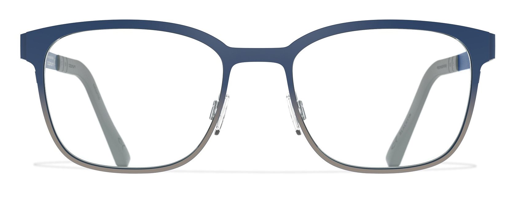
“Currently there are at least six different styles which feature the effect. Our Blackfin R&D Colour Department is continuing to work on the technique in order to offer new tonal combinations and even more elegant and sophisticated versions each time.” Blackfin’s gradient colouring process is carried out exclusively by hand. “The gradient colour is done by hand without any guide on the frame, so you really need the best skills and expertise to ensure every model is made as a unique piece of art”. www.blackfin.eu
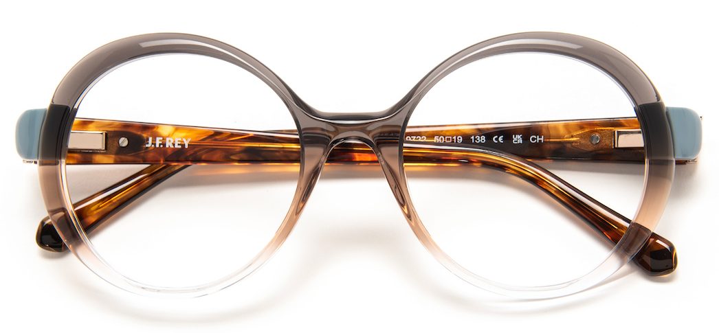
J.F. Rey also apply particular expertise and know-how to create their unique tailor-made colour combinations and gradient effects. “This season, the work we are doing in acetate colours is particularly evident in the Metis collection,” explains the J.F. Rey design team. “This line is a celebration of femininity, both modern and glamorous. We carried out elaborate work to create the sensuality of the shapes, the ’emotion’ of colours and materials, with charming shimmering reflections.”
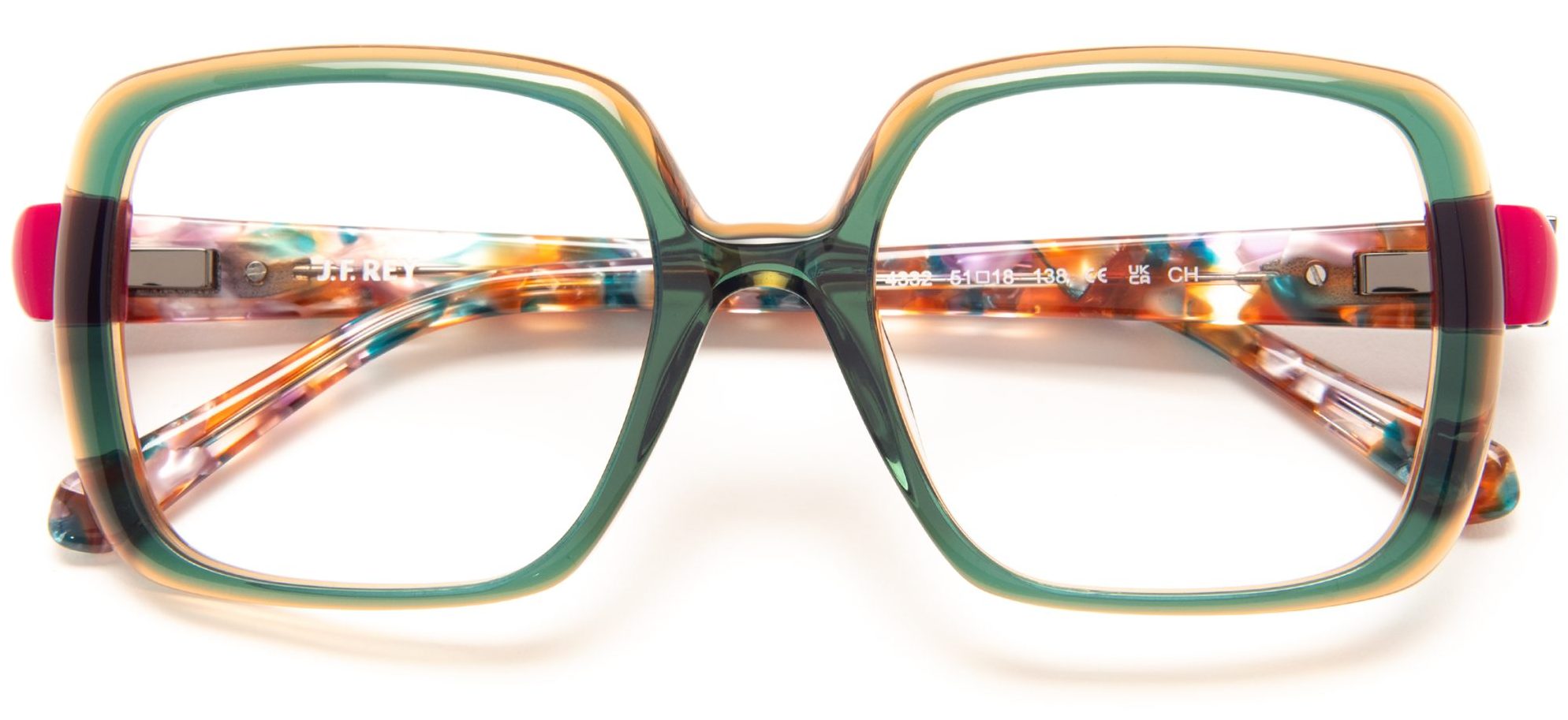
The French company is proud of its tradition of experimental colour, and the fusion of chromatic colour stories in special creative designs. The soft transparencies and subtle gradients in the current line are described as “a way to tone down the strength of the oversized shapes, bringing an aesthetic balance. In Metis, the creative team wanted to express the brand DNA with creative personality through a new stylistic horizon, a fresh look. “The line found the perfect stylistic balance, it plays with large and glamorous shapes, flattering effects, dazzling colours – even in transparencies – and textured detailing.” www.jfrey.fr

At OGI Eyewear this season, a front spray colour gradient effect is used for two key models – making the colour application feel artistic and balanced. “We love the graphic punch of a bright colour at the front as it is subdued with the complimentary colour that cascades to an ombré effect. It’s the harmonious juxtaposition of bold and subtle making it infinitely wearable with many different outfits,” says David Duralde, OGI Eyewear. “The colour story becomes more versatile and more amenable to different looks and expressions. By making the bright less bright and adding a rich mix of colour to the palette, brights become infinitely more wearable with an original twist.”

