Home

Hapter Eyewear Launches in Milan

Craft and Advanced Technology Blend Harmoniously

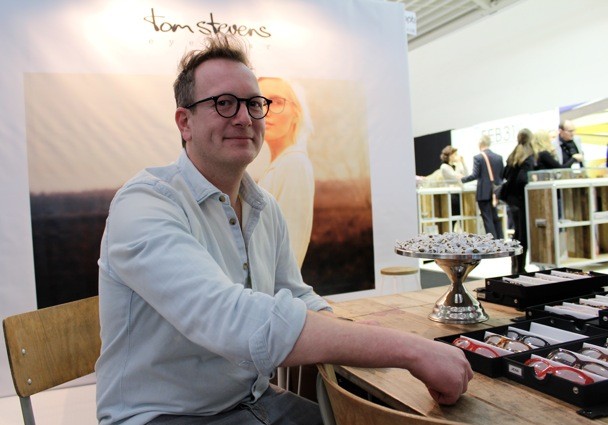
8th March 2013 When Clodagh and I were in Milan, we had the opportunity to discover Hapter Eyewear – the innovative new handmade label from Italy. Founders Eric Balzan and Mirko Forti spent three years researching and developing the exclusive industrial process that merges fine artisanship and high technology.


Hapter txtl001 - fusion of art and technology
Hapter BO1S ZP1O from the txtl001 Collection –  fusion of art and technology

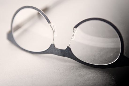
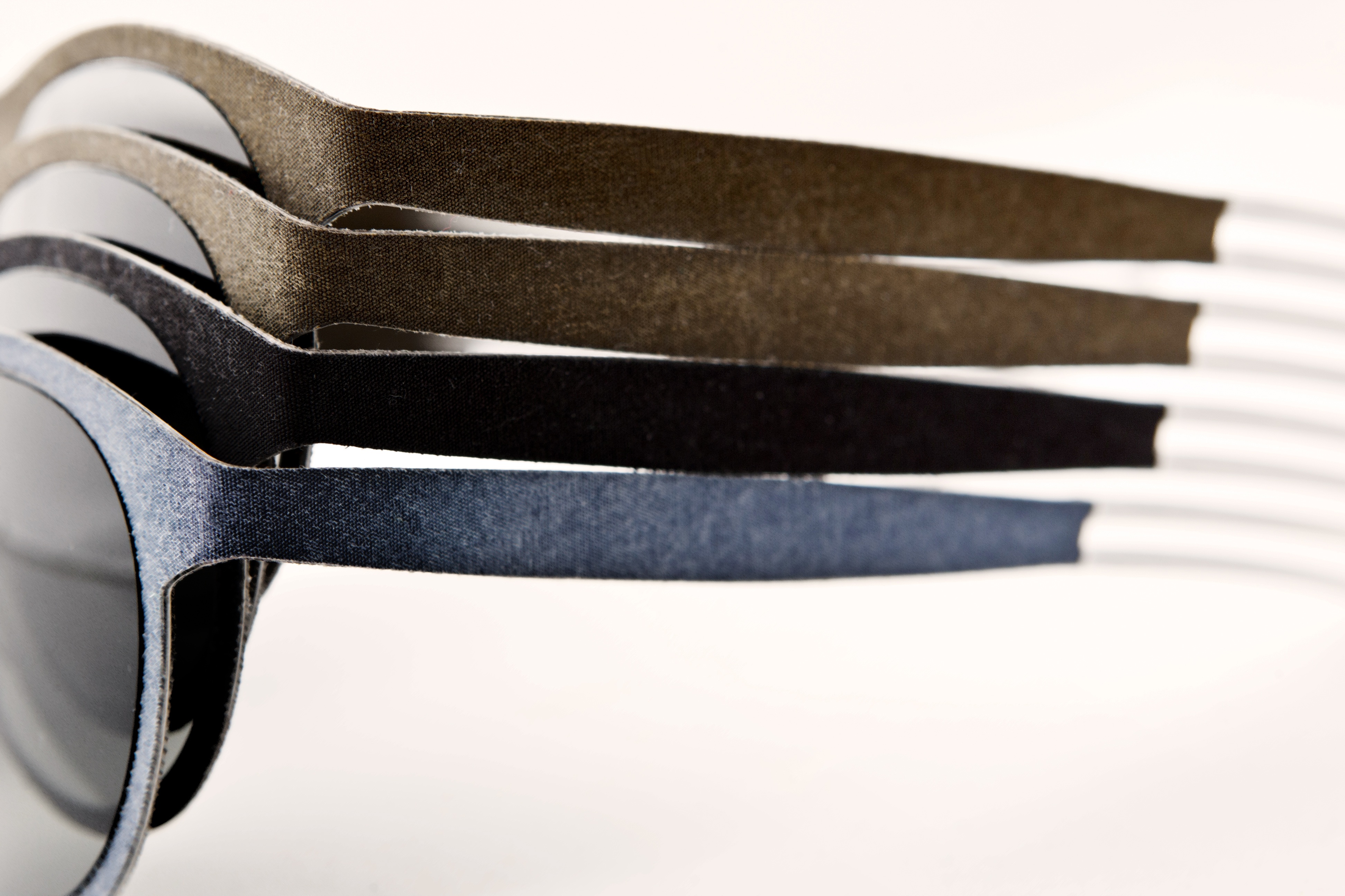
A pair of glacier military goggles from The Second World War, found in 2009 on a summit within the Dolomite Mountains, inspired the creation of Hapter. Natural fibres and stainless steel provide a flexible, light frame, yet very sturdy as well. The colours are chromatically harmonized and the result is a collection that is tactile, streamlined and functional. Hapter’s first collection has already been awarded the prestigious IF Product Design Award for 2013. www.hapter.it  JG

Eyestylist in Milan

Impactful design at the independent labels

5th March 2013 It is when you see some of the finest frames close up or worn on the face, or popped on your own, that you can get an understanding of the workmanship that some designers put into their frame designs. Eyestylist has been in Milan this weekend, to view a host of collections from across the world, and we are fortunate to hold and try on many of their prized creations.

In the past days we have seen innovative new materials and new ways of combining materials; we have seen continued dedication to old-school spectacle making techniques and finishings, and intricate tooling and finishing work both in metals – as they see the start of another re-surgence – and acetate. We have noticed some punchy, upbeat design ideas and colour stories (details will follow) and we’ve tried on some truly charismatic shapes and colours, some of which we are sure will go down in eyewear history. 

The re-emergence of metals was evident everywhere. Highlights included the clean-cut styles shown to us by Jacob Kilsgaard from Denmark, whose label specialises in aluminium; he has combined his minimal design with more concentrated blocked colours – pictured – model Sun 5.8/8, in a strong, deep purple – an alluring edgy fashion colour for this year. These sunglasses feature Zeiss lenses, a perfect partner to these precisely built technical frames. The label is one of just two leading companies in Denmark to be granted the Zeiss certification and the lenses feature a miniature logo endorsing the authenticity. www.kilsgaard-eyewear.com

Model Barcelona by Framers

At Framers, the Berlin label, the selection of colours in the super-light German-made “Titanium collection” has been extended,  inviting a powerful interpretation. The line includes the big, bold, round Barcelona style – a homage to Salvador Dali – in statement black. www.framers.de CN


Spring Inclinations

Greet The Season with COLOUR!

1st March 2013 Spring is a colour jubilee this year -dreamy, soft tones from buff, sand and cappuccino, to sprightly buttercup yellow, tangy orange and royal blue. Accent colours are in deeper tones – wine and grass among the favourites. Eyestylist spotted Jessica Hanna, Marketing Editor, Net-A-Porter.com – looking very chic in a sunny yellow coat at London Fashion Week.  Photo by Margarida Viegas at London Fashion Week, February 2013, exclusively for Eyestylist.com

Douala by Anne et Valentin

Anne et Valentin greet spring with  sunglass models that are gems with colour and design. We love the extended cat-eye shape of Douala (above) and the juxtaposition of pale and dark – pale pink is accented with moss green or wine. www.anneetvalentin.com

Colour Pop by Caroline Abram

Colour Pop is the vivacious new collection from Caroline Abram, with a trio of different tones on each frame. The classically elegant cat-eye takes on a new dimension with the combination of colours. This spring – be daring! www.filaoparis.com JG

Look
SILMO Paris - The Optical Fair. 25th - 28th September 2026
theo eyewear
Blackfin
JISCO
LOFT Santa Monica Show October 16th and 17th
Götti Switzerland
ERKERS
MOREL
SALT
Seraphin Shimmer
J.F.Rey 40 Years
TVR True Vintage Revival
OTIS Eyewear
LAMARCA EYEWEAR
DIFFUSER Tokyo
FACE A FACE
MIDO 6-8 February 2027. Welcome to Eyewearland
Article One
rolf. /></a></div></div><p> </p><p> </p></section></article><article  data-id= Category header

Eyestylist salutes men’s eyewear

this month – Cult Classics with vitality and style! Click on Reviews to find some striking designs. Our Designer of the Month is a dynamic Parisian creator, and in Boutiques, we travel to Lyon. We have also visited Linda Farrow HQ in London, to see some seriously gorgeous fashion frames.
Visit City Guides for exhibitions and other cultural delights we’ll be featuring through the month.
Click and stay with Eyestylist for the latest in eyewear excitement and fashion news.

This site is legally privileged, controlled and operated by Eyestylist.com. Material on this website may not be communicated in any way whatsoever, without the prior written authorization of Eyestylist.com.


Men’s Eyewear – The Designer Approach

Tom Stevens Eyewear The Netherlands

26th February 2013 Tom Stevens reflects on “Men’s Eyewear – The Designer Approach”

Do you have a ‘role model’ when you design?  “Sometimes I use my dad’s face to work on a design. Of course, you always think about measurements, and fitting that is typical for male faces. I usually start drawing from an image/shape in my mind. Sometimes I fine tune a design on my father’s face.”

What is your perspective on colour, shape and material? “Taste is something different for everybody. I think a frame should complement/complete the face. I do prefer somewhat rounder shapes for men, instead of the very sharp-edged, angular frames. Regarding colours, I think a male frame should make a statement. If the design is good, many colours could fit. i prefer using only one colour on a design. If you use more, for example, two-tone, it is very important that the colours complement each other very well, otherwise it could totally destroy a good design. I love titanium designs for men in basic colours, but also fashion colours, like our neon orange model Lee.” (Below – inspired by Dutch singer  Lee Towers, from the 1980’s, who is also well known for his frames).


Lee in vivid orange by Tom Stevens

Nowadays, are men more experimental with eyewear? “Yes, I can see that more and more men like to wear a statement frame. Now it is more common to wear fashionable designs instead of very basic frames. Men are not afraid to wear a frame that stands out somewhat, and men like to distinguish themselves. I like this tendency – it’s fun!” www.stevenseyewear.com JG