
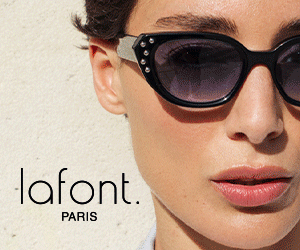
If there’s one thing Lafont always carries off with elegance, it’s their refreshingly creative blending of colours and patterns. Part of the new Spring eyewear collection, the bold classical rectangular shaping of model Gala takes on a whole new vibrancy of character in wonderful mixes of translucent light tinted crystal, patterned and deep hued voluminous acetates, each one bringing a statement style all of its own. Above: model Gala (7115) pictured in a delicate purple with pastel tones of blue and grey.

The patterned materials, much like refined couture fabrics with complex, highly worked details, are matched with precision and expertise – surprising combinations rooted in vintage inspirations, are revitalised and refreshed with exquisite quality and modern flair in signature effects inspired by natural feathers and animal prints.


Lafont Paris frames are produced exclusively in France and are registered with the “French Origin Guarantee” certification to uphold quality, transparency and traceability of all their unique products. For more information about the new collection 2020, visit www.lafont.com
 copy | Eyestylist")
Oscar Mamooi: daring splendour
The Iceland Collection by Oscar Mamooi: seven outstanding new frames with a bold design, original combination of materials and ‘gleaming’ textures which replicate the beauty of ice – each frame is named after a track by Bjork as a homage to the singer.
Irregular shapes, conceived as a reflection of the connection between man and nature characterise new eyewear work by Italian designer Oscar Mamooi – launched this month. The frames replicate the unexpected, unpredictable forms, structures and jagged edges of icebergs and glaciers, contrasted with the smoothness and tactile experience of pieces of ice. Above: model Unison in the Iceland collection

The designer has explored advanced technologies and techniques such as hot pressing, creating ad hoc moulds for every single part of the frame. “These parts are then compressed to create the acetate, giving life to surprising volume effects,” says Mamooi.

Oscar Mamooi is a multi-talented designer/stylist and illustrator. His love for eyewear dates back several years; in 2014 he designed the Celebration Collection, a tribute to Italian journalist and fashionista Anna Piaggi. See the Iceland Collection at www.oscarmamooi.com
For more about Oscar Mamooi visit https://www.eyestylist.com/2014/09/anna-piaggi-fashion-influential/

Fine-tuning colour at Kirk & Kirk
British independent label Kirk & Kirk continues to inspire a desire for bright statement colour in eyewear. Co-founder Karen Kirk says push your boundaries, and try something new, you might fall in love!
Using acrylic for frames in its Centena line, Kirk & Kirk can create its own palette of colours. What was your inspiration for the 2020 tones? Do you base the choices on what was selling well or is there more to it?
Acrylic transmits light beautifully, and I will always choose colours that work best with our material. It isn’t really a fashion thing. It’s about people, and the way you feel when you wear the frame. As we have full control over the manufacturing process, we have freedom to create our own subtleties and transparencies in colour; this is a huge advantage, as generally eyewear companies choose from pre-designed sheets from the two main manufacturers.

What is the difference in wearing a bright matt and a bright shiny frame for the wearer (if any)? Can you offer any guidelines on what tends to suit who? Generally speaking a matt material will sit on the same plane as your skin; shinier materials will have a three dimensional quality. For me, the level of transparency and colour plays a larger part. I would recommend trying different colours on your face as the best way to really tell. Many of our bright colours look amazing on dark skin tones as well as pale complexions. Pale skin can look incredible with a vibrant shade and a dramatic lip tone.

Pink was a hot colour for Kirk & Kirk in 2019. Would you agree and what advice can you give on choosing a pink frame? Yes, and it will continue to be, we have included this colour in new collections coming up! There seems to be an emotional connection to pink, it’s warm, sexy, fun and friendly.
People’s hearts seem to leap for joy (I am not exaggerating here) when they see this colour and it is usually love at first sight. When you choose a pink frame you need to own it, go with it and don’t be afraid to contrast with it. If you’re going hot, don’t be afraid of mixing with a clashing red, it can look amazing.

Colours in eyewear have generally been hotting up over the last years, but there can be worries or inhibitions over wearing really bold tones in the work place. What would you say to anyone who is a bit nervous about being bold with their colour choice? We hear this a lot, but once you start trying on colour, it is very hard to go back to that pair you were hiding behind before. Once you see the change in the way people react to you, there is usually no holding back.
Kirk & Kirk have just launched the new matt styles in the Centena Collection. They have also released 3 new styles in the Kaleidoscope Collection this week – a cat eye called Michelle, the oversized + angular Penelope, and a beautiful more minimal and understated two-tone Jane frame. For more information visit www.kirkandkirk.com or view the newly released presentation of the new models for SS20 by Jason Kirk on YouTube at https://www.youtube.com/watch?v=X69vaOmrCnY

Danish eyewear : LINDBERG strip titanium
70s and 80 influences, at the Danish brand
In keeping with the architectural overtones of eyewear trends for Spring, the new models in the strip titanium collection by LINDBERG recall the most daring of ’70s and early ’80s inspired frame shapes – revised with sharp edges and a sleek precision for contemporary impact.
LINDBERG’s ability to evolve this collection into a minimalist yet edgy concept is reliant on classic inspiration and shapes which will always be in fashion. The frames have a layered effect with acetate – achieved through precision craftsmanship that takes the interplay between the titanium and the slender acetate inner rims to new heights.

LINDBERG’s strip titanium collection continues to push boundaries through the use of innovative advanced materials combined in spectacular ways to offer absolute comfort alongside a precise and minimal aesthetic. The frames are built for the individual with a choice of special features including four different nose pad designs, three different temple lengths and multi-adjustable temple ends to establish an ideal fit. For more information about the latest styles at the Danish company visit the website www.LINDBERG.com

New angles
Angles, edges, corners. An articulated architectural style. Multi-sided, multi-faceted or softly layered. Whatever will work for you this season, we’re noting a choice of dramatic details and design flourishes defined by geometric lines and clean-cut silhouettes.
Above: SOL SOL ITO sunglasses photographed by Nina-Maria Glahé. The frames are made from high-quality acetate with hand-polished surfaces and all elements processed and refined with painstaking care. www.solsolito.com

The new proposition from Mykita and Helmut Lang offers a deconstruction of a wraparound sunshield with several component parts. The HL002 is curvilinear and fluid with a strong angular style for the design of the temple and side – the model is pictured above in white/silver flash sides with silver flash lenses. For more details visit www.mykita.com

Launching this week for the Spring/Summer season the new Essedue range of sunglasses includes hexagonal designs (model 488) and chunky shapes with visible bevelling to create a strong dynamic structured frame design. On-trend colorations include the delicate coral above and some vintage inspired tortoise tones – see more shapes at www.esseduesunglasses.com